
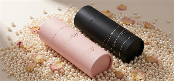
 Cosmetics
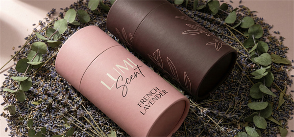 Perfume, Essential Oil
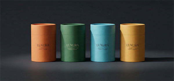 Daily Necessities
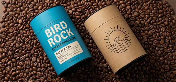 Food Paper Tube
 Personal Care
 Paper Bag
 Paper Box




Essential Knowledge on Kraft Paper Can Colors & Printing
NewsDescription
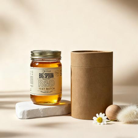
Kraft paper cans have become a mainstay in the packaging industry due to their unique texture and eco-friendly attributes. To master the visual design of kraft paper cans, you need to understand not only the "base color" of the paper itself but also the specific nuances of printing on a textured surface.
Here is a comprehensive guide to color and printing for kraft paper cans:
Understanding the "Base Color": The Substrate Sets the Tone
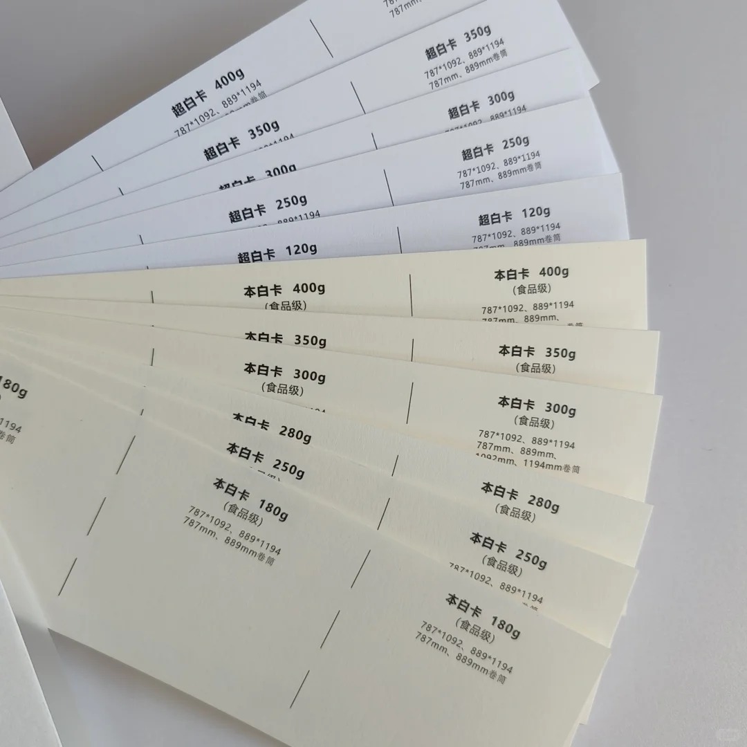
The visual effect of a kraft paper can is primarily determined by the color of the raw paper you choose. Different base colors carry different inherent "emotions."
| Paper Type | Visual Characteristics | Style Keywords | Best For |
| Natural Kraft | Natural brown/yellow, varying shades | Rustic, vintage, minimalist, eco-friendly, industrial | Tea, handicrafts, coffee beans, products emphasizing "natural" qualities |
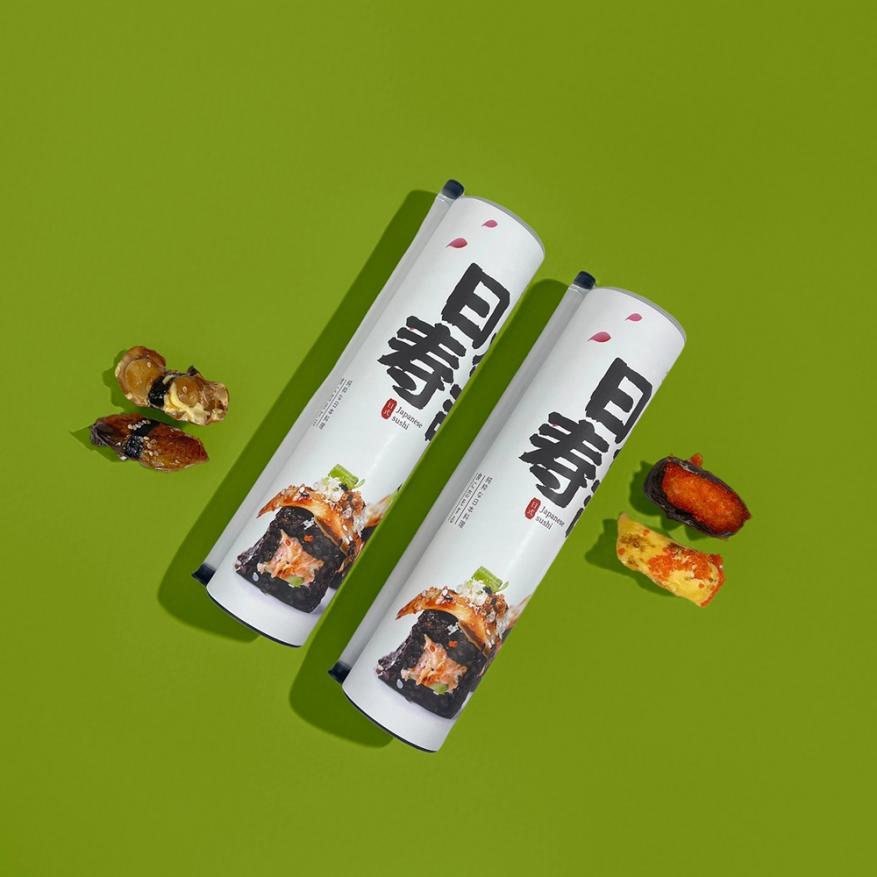
| White Kraft | Pure white, cream, or double-sided white | Clean, modern, premium, high contrast | Cosmetics, high-end gifts, illustrations requiring high color fidelity |
| Black Kraft | Deep black, charcoal grey | Mysterious, premium, edgy, solid | Essential oils, premium alcohol, men's grooming, limited editions |
Important Note (Color Variation): Kraft paper is made from natural wood pulp. Due to variations in timber batches and production seasons, there may be slight color differences even within the same batch (the industry usually allows 98% consistency). If you require absolute pure white or a specific Pantone color, we recommend using coated white kraft paper. If using natural kraft, confirm the physical color sample before ordering to avoid disappointment.
Printing Processes: How to Achieve Color on a Rough Surface?
Kraft paper has a rough surface with large pores and high ink absorption. Colors that look bright on a smooth computer screen will often appear darker and duller when printed on kraft paper.
1. Offset Printing — Best for Detailed Graphics
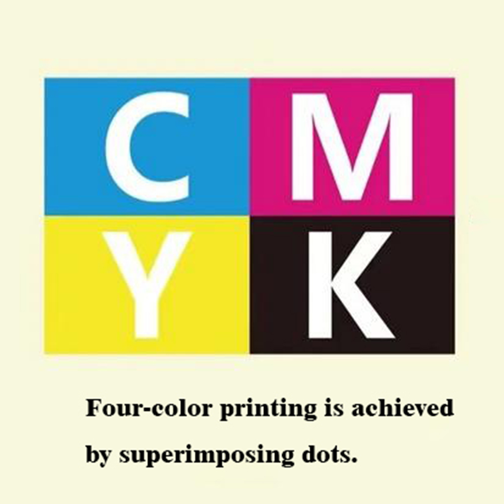
- Characteristics: High registration accuracy, excellent color reproduction, fine dot patterns.
- Best For: The perfect partner for White Kraft Paper. Ideal for complex gradients, photos, or detailed illustrations.
- Pitfall: On Natural Kraft, when printing light colors (like white or pale yellow), the dark base color of the paper can "swallow" the ink, resulting in low contrast. Solution: Use white ink as an underbase in design, or increase color saturation.
2. Flexographic Printing — Eco-Friendly & Textured
- Characteristics: Thick ink layer, distinct tactile feel, often uses water-based inks (more eco-friendly).
- Best For: Achieving a "vintage label" look. It adapts well to the rough texture of kraft paper, producing bold lines and a handcrafted, rustic feel.
- Limitation: Not suitable for very fine lines or complex gradients.
3. Screen Printing — For Accent Details
- Characteristics: Extremely strong ink coverage, thickest ink layer.
- Best For: Spot details rather than full coverage (due to cost). For example, printing a thick logo or a spot color (Pantone), creating a 3D tactile effect.
Color Psychology: Letting Colors Speak
Paper cans usually have a limited surface area, making color choice crucial as it directly conveys brand identity:
- Black + Gold/Silver: Luxury & Prestige. Perfect for high-end tea, baijiu, or business gifts, conveying "value."
- Natural + Red/Blue: Tradition & Trust. Classic Americana or retro style, giving a reliable, down-to-earth feeling, suitable for food and e-commerce.
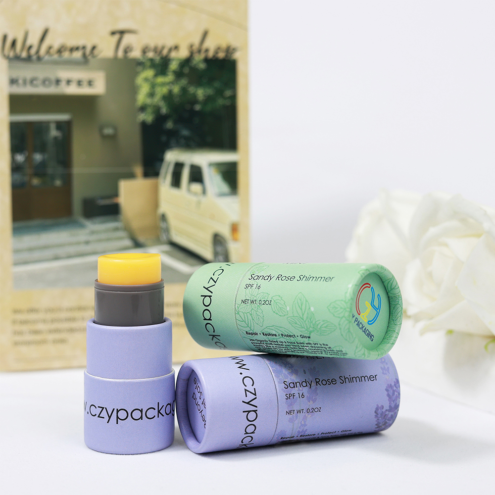
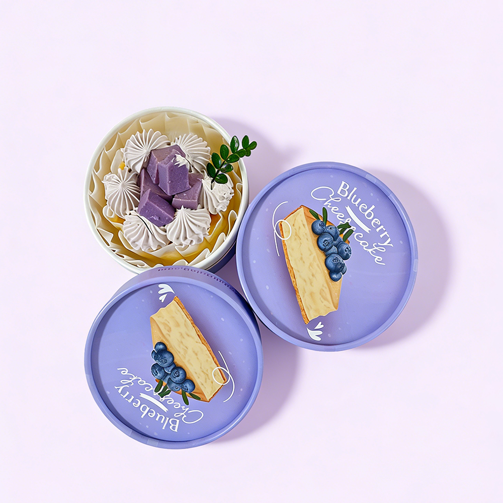
- White + Soft Tones (e.g., Morandi): Fresh & Organic. Ideal for skincare or floral tea, conveying "purity" and "nature."
- Full Spot Color: Energy & Youth. Great for snacks and trendy toys, quickly grabbing the attention of young people.
Advanced Techniques: Post-Processing (Elevating Value)
If you find plain printing too monotonous, enhance the look with these finishing techniques:
-
Lamination:
- Gloss: Increases shine, makes colors more vibrant, and provides water/scratch resistance (ideal for food).
- Matte: Creates a velvety, soft-touch finish that looks premium (perfect for minimalism).
-
Foil Stamping (Gold/Silver/Black):
- Uses heat to press metallic foil onto the paper. Even a simple logo in foil can instantly elevate the look, creating a strong contrast against the rough paper.
-
Spot UV:
- Applying a glossy coating to specific areas. Some parts are shiny (UV), some are matte (paper), creating "dual texture" and a strong design aesthetic.
-
Embossing/Debossing:
- Using a mold to create a raised or recessed texture. For example, pressing the brand logo creates a tactile quality that customers can feel, even if they can't see it.
Summary & Recommendations
- For high color fidelity: Choose White Kraft + Offset Printing.
- For a vintage, handcrafted feel: Choose Natural Kraft + Flexo or Screen Printing.
- Design Tip: On dark kraft paper, avoid using light-colored, thin fonts. The pores in the paper will absorb the ink, causing the edges of the text to blur. Use bold fonts or thick reverse-out lines instead.